Walking Dead

I had never seen the show when I got this birthday party platter order.  Several episodes and some research later, I did my best not to be too gore.and.gross without losing the excitement and anticipation of the apocalyptic zombie world (really unbelievable makeup artists and effects).

DSC_0023

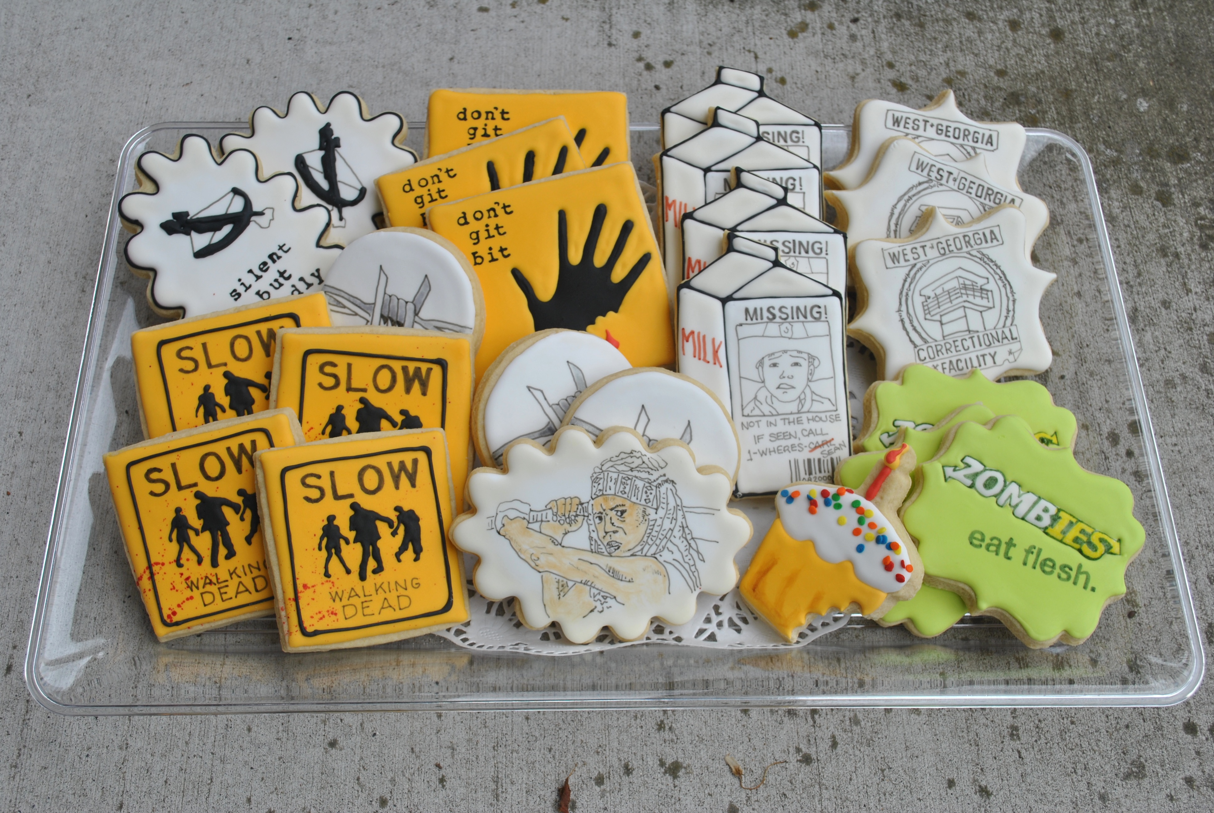
So my favorite crazy thing on the shows I watched (amongst a LOT of crazy things) was that the mother never knew where her kid was with zombie death lying around every corner.  This resulted in my ‘missing poster’ child friendly milk carton.  For personalization, I added the birthday boy’s name and his birth date in the UPC symbol.  It’s all about the details, baby.
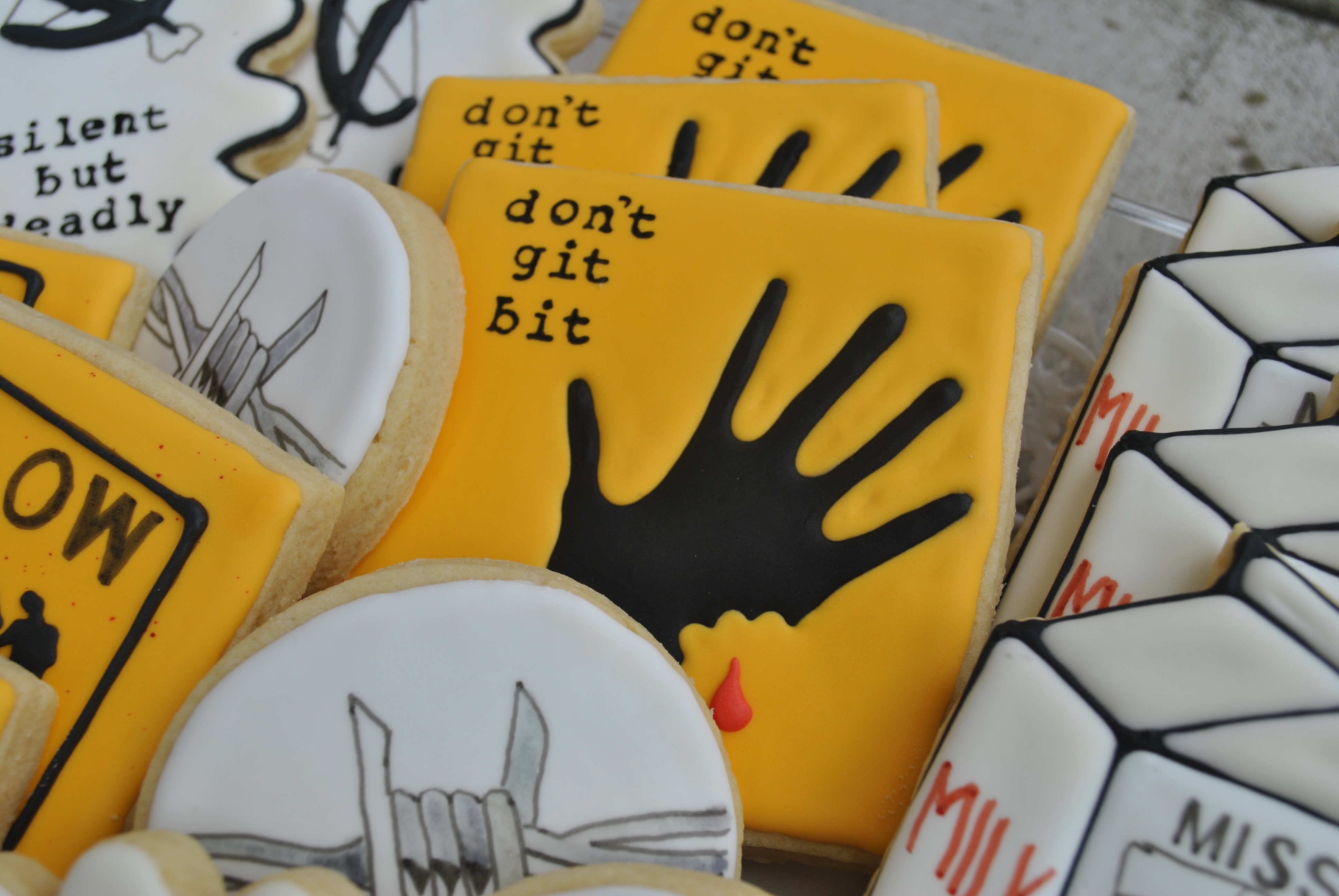
DSC_0009

Zombie road sign.

DSC_0017

Some clever person thought of this wordplay on the Subway motto.  Not me though I wish it was.  Perfect in any case.

DSC_0039

Michonne was Sean’s favorite character so I had to paint her in warrior stance.  This and the barbed wire are examples of ‘watercolor and ink’- my favorite medium only using thinned down food gel and edible ink pens!

DSC_0011 DSC_0021

Just remember…DON’T GIT BIT!

DSC_0047

Brew.ha.ha

Can you tell me a little about the birthday boy, I say?  Well…he likes beer, she says.  Interesting thing to say off the bat- anything more, I ask?  He likes Michelob, regular.  And he has a pontoon boat and likes Dale Jr.  And it’s a ‘turning 50’ party blow out, she adds.  Is it okay to tease him about his milestone age?  Please do.  And away I go…

It’s his 50th birthday:

DSC_0044 DSC_0035

In his NASCAR dreams:

DSC_0002

Been wanting to use another of John Atkinson original designs (Wrong Hands blog site– such funny comics with wit and grit)!  Thanks again to John for allowing me permission to put it on a cookie!

DSC_0026

Brew.ha.ha:

DSC_0059

The two platters for the party.  The funniest part of this whole order was the set of pictures sent by the party host.  2 were from when Tony was young; then several were from a party in Canada where some over-imbibement happened.  I was specifically instructed to include the on.all.fours.and.hurling photo.  That was a first for this cookier!

DSC_0060 DSC_0075


Come He** or High Water

Let me first say that Sydney is a fabulous swimmer (she’d have to be to make the Northwestern D-1 team). Hearty congratulations and good luck to Miss S as she heads off to Chicago this fall. All that hard work paid off! Go rule the pool!

That being said, I have to admit to a dislike.affair with purple cookies. There. I’ve said it. The darnedest color ever to match and impossible to get colleges, companies, logo masters, etc to commit to one shade. Really, really. Go google, say, ‘Northwestern University logo.’  50 different shades pop up.  And that’s the way it is with almost everything purple.  ARGH.  I decided to choose two shades & go with that.  At least I know they all had the same level of deliciousness!

DSC_0017

DSC_0013

Family Reunion (also known as Frew Fest…)

The Frew crew all went to Frewsburg for the Frew Fest.  Phew, that’s a lot of Frew(s).  But how about that?  This Frew clan- of Scottish ancestry- settled long ago in the southwestern corner of New York.  The town grew and prospered and became known as Frewsburg, New York.  Still standing today.  So the descendants of Hugh and Mary Frew appropriately gathered there for their family reunion.  And what delights the young and old at any large gathering (and ages in between)?  Why fun and fancy cookies, of course!  With a theme…

DSC_0037

There were a lot of cookies and a lot of Frew attendees!

DSC_0007

Minis are such fun: a simple plaid and “F” for (what else) Frew!

DSC_0005

Some closer pics… the Lion rampant on the Royal Standard of Scotland!

DSC_0016

Scottish thistle.

DSC_0036

Nessie.  ‘nuf said.

DSC_0031

The cookie designs with Frew in mind.

DSC_0014

Scotland supreme on this part of the set.

DSC_0033

Media Production and Lavender

I may have said this before but it bears repeating… it’s all about what the customer wants.  As always, I asked for the back story for the order.  I found out that these cookies would be made for a graduate that was quite the active, busy girl! High on her interest hit list were singing in a choir, participating in human rights activities for the Summer Institute, and writing for the NeXt section of the Buffalo News.  Also, in a short week or two,  she would be heading to Buffalo State to study Media Production. But first we had graduation cookies to personalize just for her!!!  The theme was Provence, which made me think of lavender fields.  “Kismet” says her mom as she sent me screen shots of the lavender invitation and centerpieces! So one platter was dedicated to Eliza’s interests and one to LAVENDER!DSC_0046

DSC_0037


The Buffalo State logo was a combination of pen, paint, and layering of royal icing (RI).

DSC_0014

These NeXt newspapers were made with a base coat of RI and a quick session with an edible ink pen!

DSC_0031

To represent media design, I chose a sound board, old school radio broadcast microphone, video camera, and (maybe soon.to.be old school?) traditional newsprint.

DSC_0017

The two designs for centerpieces mimicked the centerpieces that mom had made for the tables: 1) tall lavender in a terra cotta pot and 2) sprigs of purple and thistle in a mason jar.  These also combined royal icing and hand painting.

DSC_0009 DSC_0003

Initial Impression

With lots of out-of-town guests attending the wedding, the groom’s mother decided to make up welcome gift bags.  One of the treats inside the bag was this little four-pack of cookies.  Since mom didn’t want any particular theme, I went with what I knew: the couple’s colors were light pink and grey; their initial’s were “M” and “R.”   The bags used were pretzel bags found at Michael’s, Wal Mart, Hobby Lobby, even our local grocery store. They perfectly fit four 1.5 inch  cookies!

DSC_0039

I wanted the grey minis to be a bit more elegant since the pink ones were simple hearts or initials.

DSC_0009

Thank goodness for LARGE tables.  Really, really.  Some day I’ll own one of those rolling baker stands that allows you to stack cookie sheets.  But not today…

DSC_0013 DSC_0027

Final INITIAL display.DSC_0050

Geology Rocks

‘Punny’ thing about most any topic is that you can find a play on almost every word. That was true for this graduate interested in geology! Although my knowledge is middle school level at best, this ‘rock solid’ theme yielded a plethora of ideas….unfortunately more than I could use on this order.  In the cookie business, one must keep to the customer’s budget . I might be ‘boulder ‘ than most to say but I believe she was still happy with the results!


DSC_0044 DSC_0037 DSC_0041
The colors requested were electric green and bright pink. I did not have those colors in jimmies so I made my own!DSC_0035

She Sells Seashells

It was a beach themed bridal shower with an invitation that was pink with a white and diagonally striped gold border.  The bride.to.be’s name began with the letter “E” and was in cursive on the invite.  The hostess wanted “fancy” cookies for the dessert table. Here’s the resulting platter!

DSC_0011

A quick look at the individual beach-themed cookies.  The “waves.on.the.beach” original idea came from cookie genius Amber of Sweet Ambs.  Ridiculously creative and talented.

DSC_0022 DSC_0013

I did a test to show how slightly different techniques result in a different look.  Below is the same cookie design applied 2 ways.  For the cookie on the left, I first outlined the different sections with black.  This was allowed to dry and before filling in the various yellow hues (waiting to semi-dry between adjacent sections).  On the righthand cookie, I applied the white.to.yellow colors first- again letting colors semi-dry before applying the adjacent section.  This gives that quilted look.  When all colors were applied and dry, I outlined all of the sections in black.  The second is a bolder look that I decided to use on the wave as well.  No right or wrong…just 2 different methods to achieve the look you desire!

DSC_0012

Aquaholic

V is for Victory but also for Victoria.  She is heading to the University of Buffalo where she will swim for their D1 team.  Victoria is super sweet, honest and hardworking but also has a playful, whimsical side.  So I thought a few happy splashes (thank you Jill from Funky Cookie Studio) and a saying from her favorite Disney movie would give the set a lighthearted feel.

DSC_0007…Working on some different techniques; my attempt at pointillism (divisionism/neo.impressionism) was NOT spot on but, hey, you have to start somewhere.

DSC_0014

Lots of layers until the final platter was complete!

DSC_0021 DSC_0031

I went to a Garden Party

I have this friend- Kathy- who is smart, kind, funny, clever, incredibly resourceful, etc etc.  You get the idea why any and everyone would want to hang with her!  But in the summertime, it is extra lovely to be her buddy because she grows this incredible garden.  No little plot with a handful of peppers and some tomato plants- rather it is a tilled and crop-rotated masterpiece.  A HUGE undertaking from which we all benefit!  so…I thought it apropos to make her birthday cookies that would help her ‘veg out!’ with something other than veggies.  Surprise, surprise- the puns are back.

DSC_0017

What got me thinking about this theme was a trip to Crate and Barrel.  They had some vegetable plates that were humor provoking.  It doesn’t take much to send me in that general direction.  Some of the puns I had seen on-line in various places (wish I had the memory to tell you exactly where) and some just randomly popped into my head.  Hope you find them “wet your p(l)ants” funny!!DSC_0007 DSC_0023 DSC_0013